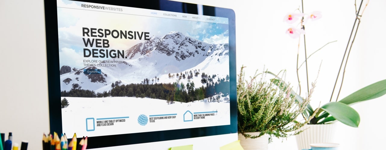
Your website is the place where you get to showcase your brand, business and all that you are about. It’s a place for you to demonstrate not only the products and services that you offer, but to show with quality with which you work. Design is therefore a key part of your website and ensuring that you make a good impression on your customers and potential customers in order to get conversions to sales. However, even behind the exterior of your site, there is more than just the initial design to consider when building your website.
The “F” Principle
The “F” Principle is something that is absolutely fundamental to designing the layout of any content on your site. This concept is something that has been discovered by tracking eye movement across a page as it opens, and the results show that the general pattern that visitors’ eyes will look at on a page is down the left hand side, then across the page to “draw” an F shape on the page. The “F” Principle is useful as it tells us that when designing a website, particular attention must be paid to these areas, for example using strong and clear subheadings breaking up your content.
Direct your audience to action
The ultimate purpose of your website is to serve your business by providing information to your customers and facilitating sales, and there are certain things that you can do to encourage this. This is where colour schemes and design elements come into their own – you can create buttons to get a quote or more information, which stand out within your theme and direct your visitors to take action and progress in their buyer journey.
At the same time, keep information concise and remember the “F” Principle when designing new pages to structure your pages in a clear and helpful way. Although you might want to give your audience great detail, too much text or content will be overwhelming and cause your visitors to leave your site.
Navigation and best practice pages
Your menu should have the same clear layout, and break down into logical pages. Some pages will best practice to include such as a “Contact Us” page, which should be to the far right of the top menu, and an “About Us” page which should be towards the left. These clearly direct your audience to the core of what your business is about and how to get in touch.
If you use drop down options from your menu, try to only use a maximum of two drop down levels to make information easier to find. If you have additional pages such as Landing Pages for email campaigns to direct to, specific Event pages, or SEO-related pages, then these can sit in the background and be useful for your SEO, but don’t need to be added to the menu.
Customer-centric website design
Your website should be something you are proud of, and that assists your customers in their buying journey. There are, of course, many other elements to consider such as mobile users, and branding, all of which Iconic Digital can help you with.
Get in touch with the Iconic Digital team today to discuss your website by calling 020 7100 0726.

