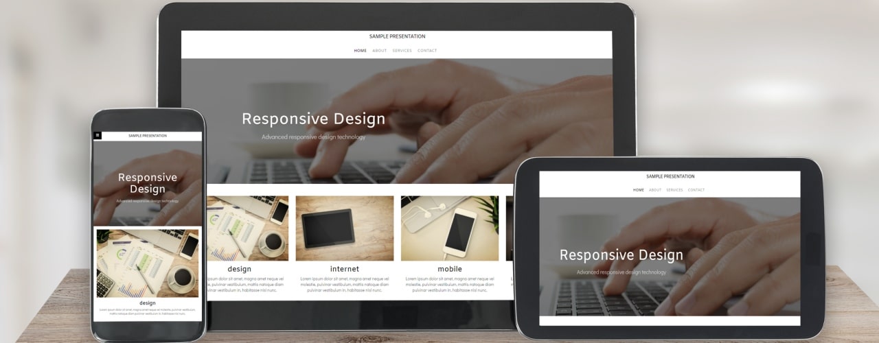
Investing in your website is crucial. As the first point of contact with consumers it can affect everything, from trust to reputation. However, given the speed at which technology and design move it could potentially be a serious drain on resources to try to maintain a website that is always on trend. What’s crucial is to determine the key features your website actually needs and to focus on developing those rather than wasting time and money on unnecessary additions.
Mobile first web design
There are two key reasons to focus on mobile first web design. The first is that mobile searches are now more numerous than desktop searches. So, if you want to reach consumers in the places they are looking for products and services, your website needs to be accommodating to mobile users. The second reason is that Google has also picked up on this and, as a result, now prioritises mobile sites in search results, making mobile a crucial component in getting found.
Integrating video
It’s not essential to incorporate video but users are increasingly showing a preference for engaging with video content and this is a much simpler and faster way to get a message across. Video backgrounds are particularly stand out and can give a website a modern and compelling feel, as well as being a great way to communicate.
Website speed
Particularly if you’re considering more images or video for your website it’s crucial to continue to bear in mind the need for speed. Consumers bounce quickly from slow loading websites – it’s not only that these are frustrating to deal with but also that slow page speeds are often interpreted as a lack of quality or even trustworthiness. You’re likely to have around three seconds to engage a consumer who has arrived on your website – if the site takes longer than that to load then you might lose your user to another, faster competitor page.
Flat design
Flat design is minimalist – and fast. It doesn’t rely as much on images and doesn’t feature large amounts of data. As a result, a flat design website will be swift to load, whether on desktop or mobile, and should be simple to navigate thanks to the clean and straightforward design.
Clear menu navigation
Navigation is one of the most important factors for optimum user experience. Your website should have a clear menu structure, with About Us and Contact Us pages, and a select few other options, such as Products or Services. Your menu should ideally not be more than 2 levels, and any additional pages should be linked from within these key pages. Mega menus showing loads of pages are a sure way to increase your bounce rate by overwhelming your visitors with too much information! Make their user journey as easy as possible by keeping the menu navigation straightforward.
These are some of the key features and ideas for websites in 2019. If you’d like to discuss the best options for your business contact a member of our team.

